by David Quartino | Sep 17, 2026 | Uncategorized
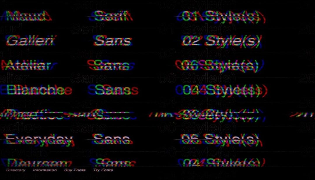
Most lists of the best fonts for YouTube thumbnails are really lists of fonts that look nice on a designer’s 27 inch monitor. That is not where your thumbnail lives. On a phone, in the YouTube home feed, your artwork is rendered at roughly 168 x 94 pixels,...
by David Quartino | Aug 23, 2026 | Uncategorized
Choosing the right font combinations for wedding invitations is one of the most underrated decisions in the entire stationery design process. The typography sets the tone before your guests even read a single word. It whispers romance, formality, playfulness, or...
by David Quartino | Jul 23, 2026 | Uncategorized
Your flyer has about three seconds to convince a buyer to stop scrolling, pick it up from a stack, or pin it to their fridge. Photography does part of the job, but typography decides whether your listing feels luxurious, trustworthy, or forgettable. Pick the wrong...
by David Quartino | Jun 1, 2026 | Uncategorized
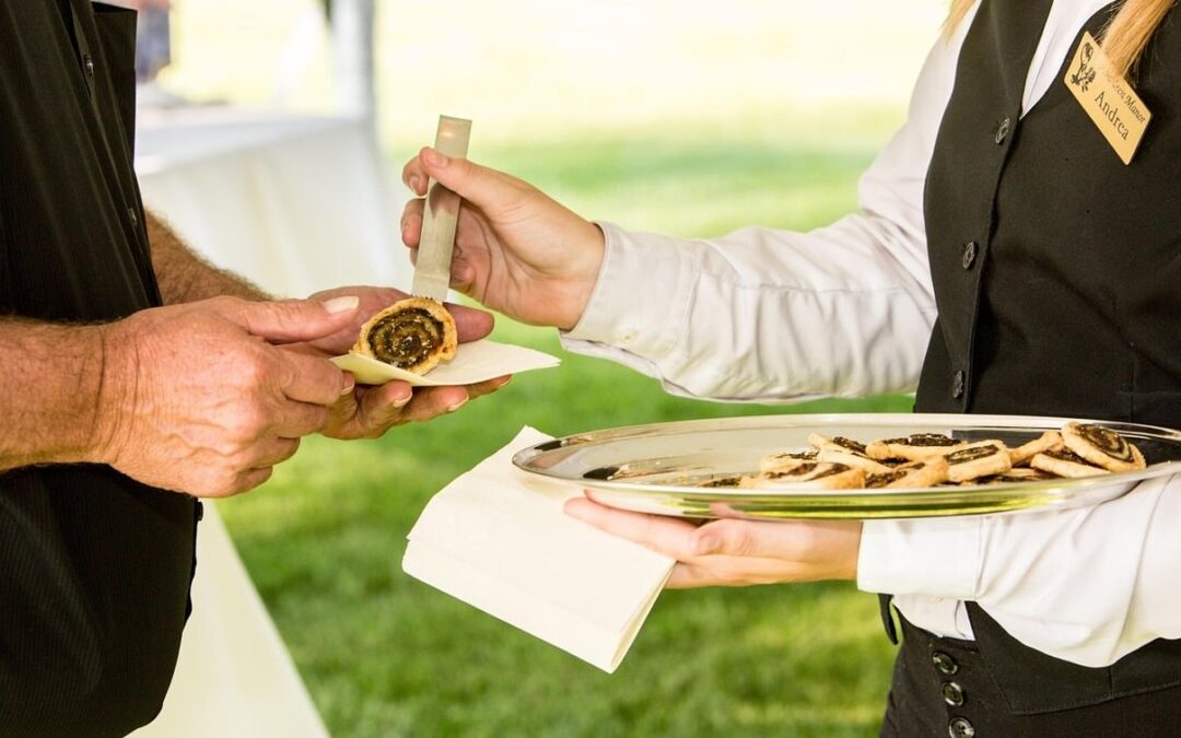
Typography for restaurant menus is far more than a design detail. The fonts you choose silently tell guests what to expect before they even read a single dish name. A swirly script can whisper “fine dining and white tablecloths,” while a chunky slab serif...
by David Quartino | May 5, 2026 | Uncategorized
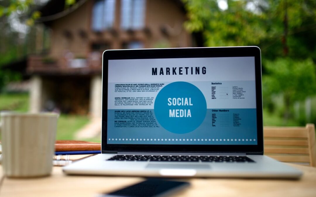
How to Choose Fonts for Presentations: Why It Matters More Than You Think You have spent hours perfecting your data, refining your message, and building your slide deck. But if your audience is squinting at the screen or struggling to follow your text, none of that...