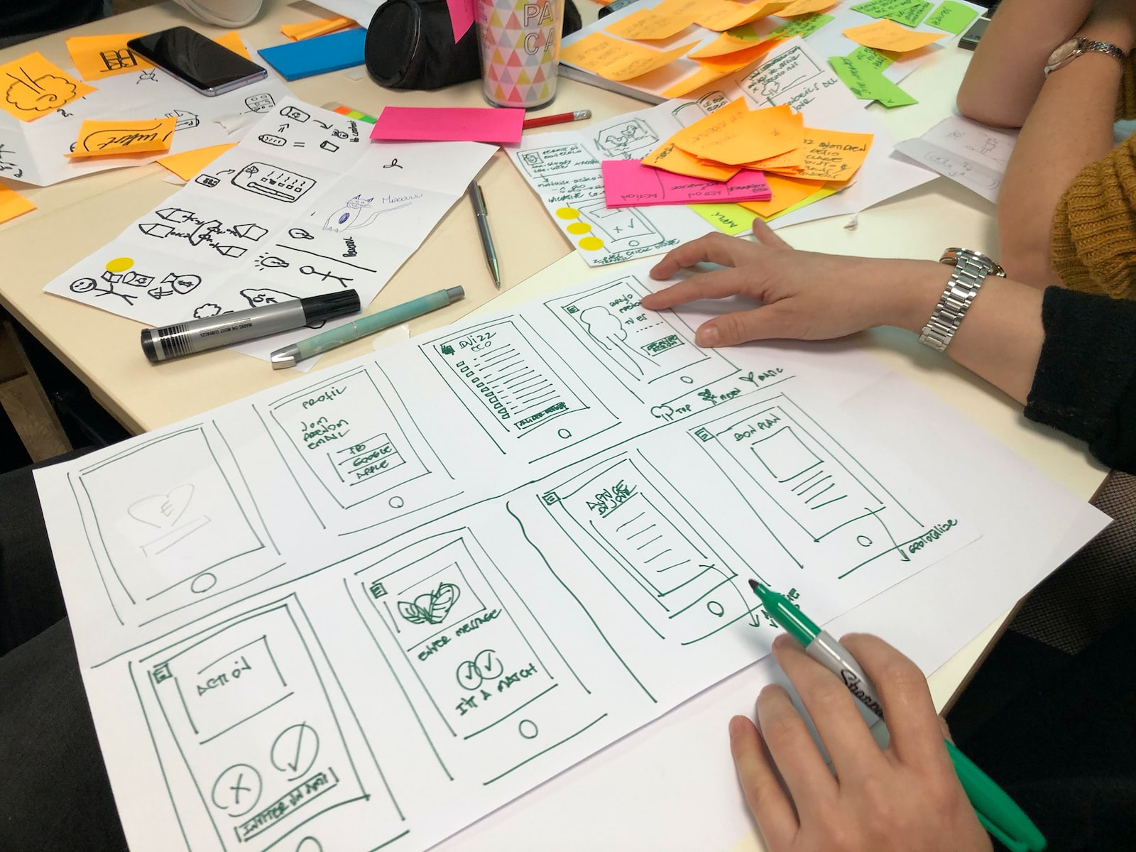
If you’re serious about your business, you want the best site you can create for yourself. Web design isn’t an exact science, and there are no hard and fast rules to follow, but some tricks can make a difference to your site’s overall look and feel. If you follow these steps, you’ll have the edge in the fight to attract new customers on the internet.
1. Have a Plan
Having a plan is key to designing a good site. This plan can be as simple as a list of pages you want to have on the site and where about each other, they will go. It could be more complex, involving elements such as the visual design and how it will affect your target audience – think about what colors and styles appeal to you and what they might appeal to.
2. Remove Distractions and Reduce Friction
When doing your research, consider your audience’s likely distractions. Focus mostly on what they will want to see, and leave out the less relevant elements. If you have a wide variety of options, you can set up your site so that it loads more quickly and doesn’t get flooded with too many links to irrelevant pages. Many people find it easier to navigate when there are only a few options rather than being forced through multiple pages before finding what they want.
3. Add Social Proof
Adding social media buttons to your site, linking to your Facebook page or Twitter feed, gives you access to the user’s social circle. With so much of people’s lives done online these days, this can make them feel more comfortable dealing with you online. They’ll feel that anyone in common with them must be good and is worth checking out. It also makes you seem more modern and relevant; many sites these days use Facebook or Twitter to show they are up-to-date.
4. Implement Calls-To-Action
Remember that the most important thing you can do is get your target audience to visit your site. You need a good call-to-action – make it clear what they are meant to do when they come to your site and ensure they feel they have explored all of the options before moving on. You probably don’t want them picking up their phone and call unless you expect them to be hard sold, but a call-to-action is often much more effective.
5. Use the Right Stock Images
Stock photography is a great way to save money and ensure you get the look you want. The internet is an ocean of stock photos, but the vast majority are not relevant to modern business; if you want a successful site, you must choose wisely! If you need help finding stock photos that are right for your site, it’s easy to hire someone to pick out images that work well with your needs. With your plan in mind, pick out some images that fit in.
6. Organized Navigation
When the page first loads, people will want to know where they can find what they are looking for. Make sure there is a good navigation system, and it’s easy to move around the site. Even if you have set up your site so that there is only one overall menu on the left, people will expect to quickly find what they’re looking for. Make sure each page has the option to move back up a level, and make it clear what is where.
7. Let Your Visitors Scroll on Your Homepage
These days, you shouldn’t be using a static homepage or even the first thing that loads. The homepage should be designed for easy scrolling so that people can see all their options simultaneously. If the design is cluttered or hard to read, and there is a lot of information on the page, it could prevent them from exploring further.
It’s important to remember that your site will only ever be as good as the quality of the information you place on it. Make sure you plan things well, use the right stock photos, and clear your navigation. Keep in mind what people expect from a website, and design accordingly. Remember that if you want to win a fight on the web, you must know how to fight.

